1. Machine stitch in handmade felt.
For this piece I please a photo copy of my own hand drawn illustration over the top of a piece of hand made white felt. I then used a sewing machine with an embroidery foot and black cotton to stitch the details and outlines of the illustration I had created. This allowed me to create a textile illustration exploring the use of machine stitch. I decided to use my illustration of a cicada as I felt it would fill as much of the felt as possible but would also make for an interesting stitched price due to the intricacy of the wings and details of the body.
I am pleased with the way this piece turned out as the black cotton contrast well again the White handmade felt allowing the viewer to be able to see the illustration clearly without it being too busy. The illustration worked well with the soft texture of the felt giving a smoothe finish to the piece. I'll,e the image itself when being used for stitch as it allowed me to create the same transparency I created when drawing the original illustration. The delicate wings worked well with the gentle and subtle stitching I had created.
When creating this piece I found it very difficult to stop the felt from getting caught under the embroidery foot because felt is a very fibrous fabric. Dying the fabric making process I tried to roll the fabric through the bamboo Matt for as long as possible to get the smoothest finish I could on the felt itself (see felt making blog post for details) this limited the speed I could see my piece, and so I had to take time to ensure this wouldn't happen.

2. Machine stitch on handmade felt with added felt fibres.
I used the same technique to create this stitched piece but to develop my idea further I wanted to add further texture and colour. For this I added needle felted felt fibres in the same colour as my original illustration. For this piece I chose my illustration or a bumblebee as I thought it would work sell with the texture of the felt fibres as they would act as the fur/hairs found on the bumblebee itself.
I started by machine stitching the illustration onto the felt fibres like in the previous sample and used a felting needle to poke the fibres through the felt sample allowing some of them to poke through the surface. I layered the felt fibres until the piece because padded and almost three dimensional and I thought it would give s better impression of a bumble bee. Once I had a sufficient amount of fibres into the felt I then used the felting needle to neaten up the edges.
I liked the way this turned out as it added a different texture to my felt samples as I felt it gave a similar texture to a realistic bumble bee. I like the way the colours are well separated to allow definition to each block of colour.
I like the contrast between the needle felted fibres and the illustration itself as the illustration I created used hard stitching in a smooth surface whereas the needle felted fibres had a much rougher texture much like the texture you would find on a real specimen.
When creating this piece I found it difficult not to felt over the original lines of the illustration below. Because of this I decided that I would needle felt over the wings of the piece. If I was creating a much larger piece this would have been easily avoided but the illustration below would not have been seen. I could however have re-stitched over the needle felting with white thread by hand to add the wings in again but this could be very difficult due to the thickness if the fabric and felted sample.
3. Detailed machine stitch on handmade felt.
Like my other two machine stitch and felt samples I used the sam technique to apply my illustration but this time I decided to use much thicker lines and more detail to make the piece more representational of what I was trying to achieve. I made the lefts and body of the specimen much more detailed.
I like the way this illustration turned out as the lines are very strong but are also quite expressive due to the way the lines are places onto the sample. I would have liked to add more to this sample ask feel if is lacking detail and further techniques to make this piece more aesthetic. But I found that when I was stitching the piece the felt sample I had used was very thick and well structured making it difficult to pass both machine needle and hand sewn needle through the fabric, limiting me to the amount of embellishing I could do.If I were to re-create this piece I would use a thinner felt sample to allow me to embellish it accordingly using hand stitch and appliqué to make my piece further more representational.
4. Machine stitch on handmade silk paper.
I decided to develop one of my hand drawn illustrations further by using a series of different textile techniques to see what textures they would create. I started by photo copying the original pencil study and placed this photo copy onto apiece of hand made silk paper. I then stitched over this with machine embroidery. I decided to sitch the main outlines of the piece to allow the silk papers colour and texture to add to enhance the illustration.
After stitching the whole piece I started to remove the paper from underneath the stitch but found it difficult to remove as it began to tear the silk paper itself. I decided to prevent this I souls turn the piece back to front so that the illustration itself was reversed. If I were to recreate it I would reverse the illustration before I start stitching into the piece. This would allow the illustration to face the right way when I reverse the stitched piece.
I started by machine stitching the illustration onto the felt fibres like in the previous sample and used a felting needle to poke the fibres through the felt sample allowing some of them to poke through the surface. I layered the felt fibres until the piece because padded and almost three dimensional and I thought it would give s better impression of a bumble bee. Once I had a sufficient amount of fibres into the felt I then used the felting needle to neaten up the edges.
I liked the way this turned out as it added a different texture to my felt samples as I felt it gave a similar texture to a realistic bumble bee. I like the way the colours are well separated to allow definition to each block of colour.
I like the contrast between the needle felted fibres and the illustration itself as the illustration I created used hard stitching in a smooth surface whereas the needle felted fibres had a much rougher texture much like the texture you would find on a real specimen.
When creating this piece I found it difficult not to felt over the original lines of the illustration below. Because of this I decided that I would needle felt over the wings of the piece. If I was creating a much larger piece this would have been easily avoided but the illustration below would not have been seen. I could however have re-stitched over the needle felting with white thread by hand to add the wings in again but this could be very difficult due to the thickness if the fabric and felted sample.
3. Detailed machine stitch on handmade felt.
Like my other two machine stitch and felt samples I used the sam technique to apply my illustration but this time I decided to use much thicker lines and more detail to make the piece more representational of what I was trying to achieve. I made the lefts and body of the specimen much more detailed.
I like the way this illustration turned out as the lines are very strong but are also quite expressive due to the way the lines are places onto the sample. I would have liked to add more to this sample ask feel if is lacking detail and further techniques to make this piece more aesthetic. But I found that when I was stitching the piece the felt sample I had used was very thick and well structured making it difficult to pass both machine needle and hand sewn needle through the fabric, limiting me to the amount of embellishing I could do.If I were to re-create this piece I would use a thinner felt sample to allow me to embellish it accordingly using hand stitch and appliqué to make my piece further more representational.
4. Machine stitch on handmade silk paper.
I decided to develop one of my hand drawn illustrations further by using a series of different textile techniques to see what textures they would create. I started by photo copying the original pencil study and placed this photo copy onto apiece of hand made silk paper. I then stitched over this with machine embroidery. I decided to sitch the main outlines of the piece to allow the silk papers colour and texture to add to enhance the illustration.
After stitching the whole piece I started to remove the paper from underneath the stitch but found it difficult to remove as it began to tear the silk paper itself. I decided to prevent this I souls turn the piece back to front so that the illustration itself was reversed. If I were to recreate it I would reverse the illustration before I start stitching into the piece. This would allow the illustration to face the right way when I reverse the stitched piece.
I like the way my silk paper illustration turned out as the silk paper itself gave a used appearance. Almost like the way Mr Finch uses used fabric to create his pieces. The flecks the silk cocoons create in the fabric act as the feathers on the bird.
I also like the way the black stitch stands out against the handmade paper as there is a nice contrast between the two textures. Once appears rough even though it is smooth and easy to stitch on whilst the other is hard and strong allowing it to stand out against the paper background. 
I came across some limitations whilst creating this piece. Due to the nature if the silk paper it is not very strong. This would mean a lot of machine stitch may cause damage to the paper itself which could cause the illustration to be damaged as well. I attempted to create thicker pieces of silk papers, but whilst doing this the fibres would not bind together due to the lack of moisture and heat in the middle of the paper sample. This would mean I would not be able to make thicker and stronger pieces of silk paper to work upon.
5. Batik on fabric with added machine stitch.
For this piece I first traced my design onto a piece of fabric (bird illustration). I then used the batik method of dying to draw the design in wax. This would then allow me to dye the piece without allowing colours to bleed into one another and allow me to sepperately dye specific areas as well as adding line work to the piece (see batik post for more details) once I had drawn on the design using the wax technique I then used the batik dyes like water colour paints to paint in the non-waxed areas of the design avoiding the background of the piece. I used a similar colour scheme to the specimen I was inspired by this included blacks and browns which I mixed with the primary colours in the dye and a black. I used these in the darker areas and water to blend the colours out to give an impression of shadow and form. I then left my piece to dry.
Once the batik piece was dry I then removed the wax by applying heat to the area. To do this I placed sugar paper over the top of the piece and used an iron to draw out the wax.
After all the wax was removed from my piece I then enhanced the sample with machine stitch with loose threads. I used black cotton as I thought the dark edges would allow me to define certain areas of the piece and make it more recognisable.
I am pleased with the result of my batik piece as the colours work well for a representational batik design. I also feel they are relevant to my chosen image an allow me explore their texture through the use of added water.
I also like the way the was resisted the dye leaving white borders around the dyed areas which I then outlined with stitch.
I am pleased with the way my machine stitch turned out as it added further texture to the work and has allowed me to explore the effect machine stitch has on different materials and designs.
Over all I am pleased with my batik piece as the design works well with these processes and has allowed me to create a nice sample. 
When creating this piece I struggled to get the machine stitch perfect. Unlike other machine stitched pieces this piece was not a continuous line which made if very difficult to stitch as every area had to be stitched one by one. This limited the amount of stitching I could place on the piece.
I also found that when I placed my piece in an embroidery hoop for machine stitch the fabric became very taught causing the needle to break. This is very dangerous and so I decided to remove it from the embroidery hoop all together. After taking it out of the embroidery hoop it became easier to stitch but also loosened the tension making slight loops throughout the piece of work. I would need to tighten the tension to allow me to continue working with machine.
6. Machine and hand stitch
For this piece I used he same piece of imagery and the same technique to apply this to the fabric but I decided to create a more representational piece. I used large amounts of machine stitch and a series of threads to create a basic line drawing and begin to fill it in using heavy machine sitting.
Whilst creating my piece I had placed it into an embroidery hoop. The more I stitched the more taught it became till eventually the sewing machine needle snapped. Due to this I decided to constitute working into the piece using hand stitch in a similar method to the way I was sewing my machine stitch.
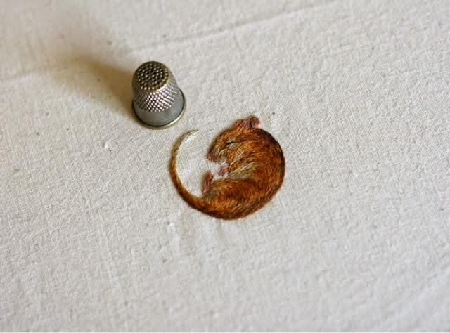
I used a variety of different colours similar to the way Chloe Giordano creates her Work blending the colours together and highlighting important areas.
I am very pleased with the way my machine embroidery piece turned it out as I like the texture of the different stitches and the effect they had on the over all piece. I like the way the machine embroidery stands out well against the white fabric. The colours I used compliment bed each over and give a good impression of the specimen I was inspired by.
I like the direction of the stitch and they way this effect the texture and structure of the sample. I tried to sew in the same gradient as the feathers in the actual specimen so when I were finished with my hand stitch if would almost look like feathers on the bird.
I like the way the piece on a while stands out against the white of the fabric and the way the textures constant against each other If I could improve my piece I would ensure I would take more care when sewing into the piece and remove the embroidery hoops to prevent it from snapping further needles as the piece was placed in an embroidery good forcing the fabric to become very tight and taught which would not allow the sewing machine needle to pass through without it snapping.
If I could not do this I would place the piece onto a bigger piece of fabric and therefore use a larger embroidery good to creae less tension whilst stitching.